 zafarhaseeb423@gmail.com
When the air turns crisp and the leaves start to drift, our instinct is to retreat indoors and create a sanctuary. Autumn is the perfect excuse to rethink your living room, moving away from the bright, breezy shades of summer toward something more grounded. Earthy color palettes do exactly that—they bring the outside in, wrapping your space in the warmth of baked clay, golden foliage, and deep, rich soil.
If you are looking for a quick overview, this guide explores the psychological benefits of warm tones, highlights famous design styles that champion these colors, outlines essential pre-decorating considerations, and details twelve distinct, nature-inspired palettes to transform your living room.
The Impact of Earthy Tones on Your Daily Life
Color is more than a visual experience; it directly influences how a room feels and how you feel inside it. Warm, earthy tones—think rust, ochre, moss, and taupe—have a profound grounding effect on the human nervous system.
Unlike stark whites or high-energy primary colors, these natural hues lower visual stimulation. Coming home to a living room layered in muted terracotta and deep brown visually signals to your brain that the workday is over. These colors mimic the natural environment, fostering a sense of stability, reducing stress, and encouraging genuine relaxation and conversation.
Famous Decor Styles Rooted in the Earth
You don’t have to invent a new aesthetic to use these colors successfully. Several celebrated interior design styles already rely heavily on earthy palettes:
- Mid-Century Modern: Famous for its warm wood tones (like teak and walnut) paired with mustard yellows, olive greens, and burnt oranges.
- Desert Boho (Bohemian): Heavily features warm sandy neutrals, terracotta, and soft dusty pinks, layered with natural textures like rattan and macramé.
- Organic Modern: Blends the clean lines of modern design with nature-inspired elements, utilizing rich browns, warm whites, and muted greens to create a soft, inviting minimalism.
- Rustic Farmhouse: Focuses on natural materials, pairing deep barn reds, forest greens, and warm creams with raw, reclaimed wood.
Important Things to Consider Before Decorating
Before you pick up a paintbrush or order a new velvet sofa, take a moment to evaluate your specific living room. Earthy colors are forgiving, but they interact strongly with light and space.
| Factor | What to Look For | Decor Strategy |
| Natural Light | Does your room face North, South, East, or West? | North-facing rooms have cool light; use warmer shades like rust and mustard to compensate. South-facing rooms get warm light; you can safely use deeper shades like olive and espresso. |
| Room Size | Is your living room compact or sprawling? | In small rooms, use lighter earthy neutrals (warm beige, soft sage) as the base, keeping dark browns or deep oranges for accents. Large rooms can handle deep, moody base colors on the walls. |
| Existing Fixed Elements | What color is your flooring, fireplace, or large permanent furniture? | Ensure your new palette complements these unchangeable items. A cool gray tile floor might clash with a yellow-based mustard wall, but it will pair beautifully with dusty rose or charcoal. |
12 Warm Earthy Living Room Palettes
Here are twelve distinct ways to bring the warmth of autumn into your home.
1. Terracotta & Soft Sage
This pairing balances warmth with a touch of freshness. Terracotta brings the heat of baked earth, while soft sage provides a cooling, organic contrast.
How to use it: Paint an accent wall in a matte terracotta. Anchor the room with a sage green linen sofa, and pull the look together with natural jute rugs and light oak wood side tables.
2. Mustard Yellow & Deep Chocolate
Rich, nostalgic, and incredibly cozy. This palette leans slightly retro but feels entirely modern when applied to contemporary furniture silhouettes.
How to use it: Use deep chocolate brown as your grounding color through leather armchairs or a large area rug. Introduce mustard yellow through heavy velvet curtains, throw pillows, and ceramic table lamps.
3. Burnt Orange & Warm Cream
If you want a space that feels like a glowing hearth, this is your palette. Warm cream keeps the room bright and open, allowing the burnt orange to pop without overwhelming the senses.
How to use it: Keep the walls and main seating in warm, textural creams (think bouclé or chunky knit blankets). Add burnt orange through bold artwork, woven throws, and decorative trays.
4. Olive Green & Chestnut Brown
A classic, woodland-inspired combination that feels sophisticated and deeply relaxing. It mimics the deep woods just as the leaves begin to turn.
How to use it: Drench your walls—including the trim—in a muted olive green. Pair this moody backdrop with a chestnut leather sofa, brass lighting fixtures, and dark walnut shelving.
5. Rusty Red & Oat
Rusty red has a faded, vintage quality that feels much more approachable than a stark crimson. Paired with a soft, grainy oat color, it creates a comforting, farmhouse-inspired vibe.
How to use it: Use oat for your wall color and large upholstered items. Introduce rusty red in a vintage Persian-style rug and patterned throw pillows.
6. Caramel & Charcoal Gray
Earthy doesn’t always mean strictly brown and green. Charcoal gray acts as a natural stone element, while warm caramel adds the necessary autumn heat.
How to use it: A charcoal gray fabric sofa acts as a great modern anchor. Warm it up instantly with caramel leather accent chairs, amber glass vases, and a roaring fire in the grate.
7. Amber & Forest Green
This jewel-toned earthy palette is rich and luxurious. It feels like a walk through a dense, sun-dappled forest in late October.
How to use it: This palette works beautifully with rich textures. Think forest green velvet seating paired with amber glass pendant lights and polished brass hardware.
8. Warm Beige & Muted Copper
For those who prefer a neutral living room but want to acknowledge the changing seasons, this subtle palette is perfect.
How to use it: Layer different shades of warm beige through your wall paint, rugs, and seating. Add metallic flashes of muted copper through picture frames, candle holders, and side table legs.
9. Taupe & Spicy Cinnamon
Taupe is the ultimate bridge between gray and brown, providing a quiet background for the fiery kick of spicy cinnamon.
How to use it: Paint your living room walls a medium taupe. Bring in the cinnamon shade through heavily textured items like corduroy floor cushions, knit throws, and terracotta pottery.
10. Goldenrod & Espresso
A high-contrast palette that feels energetic yet grounded. Espresso provides a deep, almost black anchor, while goldenrod mimics the autumn sun.
How to use it: Dark espresso wood floors or a large dark coffee table set the stage. Use goldenrod for a statement piece, like an accent chair or a large, abstract canvas on the wall.
11. Dusty Rose & Mushroom
Earthy palettes can be soft and feminine, too. Mushroom is a complex, earthy gray-brown that pairs beautifully with the muted warmth of dusty rose.
How to use it: Use mushroom for your cabinetry or built-in bookshelves. Add dusty rose through linen curtains, dried floral arrangements (like pampas grass or dried hydrangeas), and soft wool rugs.
12. Brick Red & Camel
Drawing inspiration from historic architecture and classic autumn wardrobes, this palette is tailored and timeless.
How to use it: Keep the walls a soft, warm white. Bring in a camel-colored sofa and flank it with brick-red accent chairs or heavy drapery.
Practical Tips for Applying Your Palette
When executing your chosen design, remember that texture is just as important as color. An earthy palette falls flat if everything is shiny and smooth. Mix matte paints with rough linen, smooth leather, and raw wood.
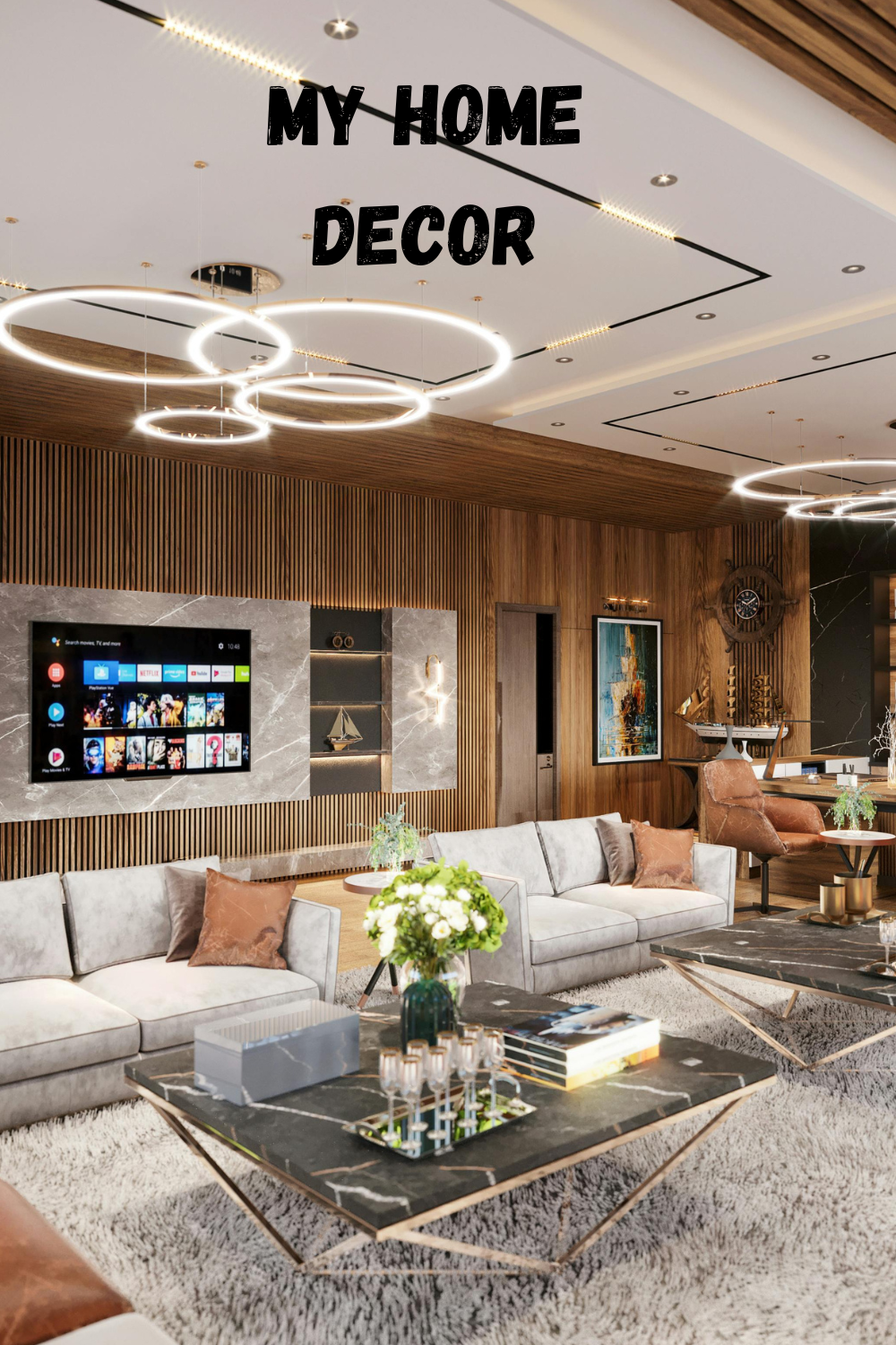
If you plan to document your DIY progress or create mood boards to share with your audience online, formatting matters. For instance, when designing inspiration graphics to save and share, setting your canvas to 1000 × 1500 pixels ensures your images are perfectly optimized for vertical scrolling, allowing the rich details and layered textures of your earthy living room to truly stand out.
Frequently Asked Questions
Can I use earthy colors in a small, dark living room?
Yes, but focus on the lighter end of the spectrum. Use warm creams, oats, and soft sages as your primary colors. Bring in deeper colors like rust or espresso only as small accents (like a picture frame or a single throw pillow) so you don’t absorb the limited light.
Do I have to change my furniture to match a new autumn palette?
Not at all. You can completely shift the color palette of a room using textiles and accessories. A neutral gray sofa can easily be warmed up for autumn by adding mustard yellow pillows, a burnt orange throw, and a vintage rug featuring warm earthy tones.
How many colors should I include in my palette?
A standard design rule is the 60-30-10 rule. Use your dominant color for 60% of the room (usually walls and large furniture), your secondary color for 30% (rugs, curtains, accent chairs), and your boldest accent color for 10% (lamps, pillows, art).
Transitioning your living room for autumn is all about embracing the natural rhythm of the year. By bringing the deep, rich colors of the outdoors into your home, you create a space that practically invites you to slow down, brew a hot cup of coffee, and appreciate the comfort of your surroundings. Whether you lean toward a subtle warm beige or a bold terracotta, there is an earthy palette ready to make your living room the coziest spot in the house.